Lorenz curve
A Lorenz curve is a graphical representation of income inequality or wealth inequality
Brief Explanation
Imagine the Lorenz curve as a visual snapshot of how money or assets are spread out among the people in a community. Max O. Lorenz created this nifty Graph in 1905 to help us understand wealth inequality.
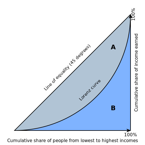
Building this curve involves some plotting magic. We arrange the population from the poorest to the richest on the horizontal axis. On the vertical axis, we map out how much of the total income or wealth each segment of the population has. Think of this curve as a rollercoaster ride – the ‘line of equality’ is like the smoothest, flattest part of the track. It represents a perfect world where everyone has an equal slice of the pie. Any bumps or dips below this line show us inequality. The deeper the descent, the more unequal things are.
Here’s the cool part: we can use this curve to crunch numbers. The Gini coefficient, our trusty mathematical tool, measures inequality. It swings between 0 (utopian equality) and 1 (nightmare-level disparities). A higher Gini coefficient means more inequality.
Economists and policymakers love Lorenz curves because they offer a peek into the distribution of wealth and income. They’re like a magnifying glass for inequality, helping us compare different places, times, and groups of people.
Take a look at the Lorenz curve for a fictional country. In this land, the poorest 20% only pocket 5% of the total income, while the wealthiest 20% walk away with a whopping 60%. That’s a Gini coefficient of 0.55, waving a big red flag for high inequality.
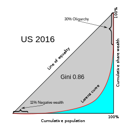
You can even use Lorenz curves to play the comparison game. For instance, compare the turn for the United States with Sweden’s. The US curve is curvier, indicating more income inequality compared to Sweden.
In a nutshell, Lorenz curves are like treasure maps for understanding inequality. They help policymakers decide if measures are needed to level the playing field and give everyone a fair shot at economic success.

Let’s break down the construction of the Lorenz curve into simple steps:
1. Gathering Data: Building a Lorenz curve begins with collecting information about the income or wealth of individuals or households within a specific population.
2. Organizing Data: Once you’ve collected this data, it’s time to organize it systematically. Imagine arranging it like a ladder from the most negligible income or wealth at the bottom rung to the highest at the top.
3. Calculating Cumulative Percentages: Now comes the math part. Calculate the cumulative percentage of the total income or wealth owned by each part of the population. This means adding up the income or wealth of a group and dividing it by the total income or wealth of everyone.
4. Creating the Graph: Get ready to begin the visual representation of this data. Picture a graph where the horizontal line (x-axis) shows the cumulative percentage of the population, usually ranging from 0% to 100%. The vertical line (y-axis) represents the cumulative percentage of income or wealth. Start plotting points on this Graph based on the cumulative rates you figured out in the previous step.
5. The Line of Equality: There’s a unique line called the “line of perfect equality.” You can also call it the “line of equality” or the “45-degree line.” It’s like the gold standard on this Graph. This line runs diagonally from the bottom-left corner to the top-right corner, forming a perfect slope of 45 degrees. It symbolizes a world where income or wealth is divided evenly, where each person or household has the same share of the pie.
Constructing a Lorenz curve is like assembling a visual story of how income or wealth is distributed among a group. It begins with data collection and ends with a graphical representation that helps us understand the fairness or inequality in that distribution. The closer the curve is to that perfect 45-degree line, the fairer the distribution; the further away, the more uneven the distribution becomes.
Gini Coefficient
It is often used to gauge economic inequality, measuring income distribution or, less commonly, wealth distribution among a population. The coefficient ranges from 0 (or 0%) to 1 (or 100%), with 0 representing perfect equality and 1 representing perfect inequality. Values over 1 are possible due to negative income or wealth.
Relation Between Gini Coefficient and Lorenz curve

- If the Lorenz curve closely hugs the line of perfect equality, the Gini coefficient will be low, indicating low inequality.
- If the Lorenz curve deviates significantly from the line of perfect equality, the Gini coefficient will be higher, indicating greater inequality.
So, the Lorenz curve and the Gini coefficient are complementary tools. The Lorenz curve gives you a visual representation of inequality, while the Gini coefficient provides a single, concise number that summarizes the level of inequality. They help policymakers, economists, and researchers assess and compare income or wealth disparities within and between populations.
M.C.Q.
Which one of the following curve best describes about relationship between per-capita Income and Income Inequality ?
A. Laffer curve
B. Lorenz curve
C. Kuznets curve
D. Phillips curve


